


Soundbox: UI development
UI + UX + Mobile
Soundbox: UI development
UI + UX + Mobile
Soundbox. Turn your Playlist Into your Funlist
A start-up venture wanted to create a new way to enjoy music on your phone. The concept was to create an app that would help you organize and enjoy the music already in your phone.
Given a rough block-out of the interface, I created the visual face of the the app along with concepts of how users would interact with their playlists.
I also directed the look and feel of the marketing for the app, helping create the name and logo.

C-Link (Connect Me)
UX + UI + Agile + Enterprise
C-Link (Connect Me)
UX + UI + Agile + Enterprise
A unified, personalized, simplified employee experience
Primarily designed with employees in mind, ConnectMe can make life easier for HR teams. For employees –and for dedicated HR professionals – ConnectMe focuses on what matters to you.
" It’s time to deliver an integrated HR service delivery solution to support management of the employment life cycle. ConnectMe helps maximize the value of existing HR technologies by pulling them together into one personalized space—easily sharing information and enabling actions important to users."
My Role
I was senior UX/UI designer or the C*link interface.
I started the project helping to lead an experience session that included project owner, project manager, and the complete team that would be working on the interface, from developer to business analysts.
I working with another UX researcher, I wireframed the interface for each sprint, and then created final UI layouts for desktop and Mobile.
evolution
The C*link interface continued to evlove and improve even after I left the project. It has since been rename Connect Me.
PRESS RELEASES FOR ORIGINAL C*LINK INTERFACE

Georgia Power: Lakes and Recreation Website
UI + Art Direction + Photography
Georgia Power: Lakes and Recreation Website
UI + Art Direction + Photography
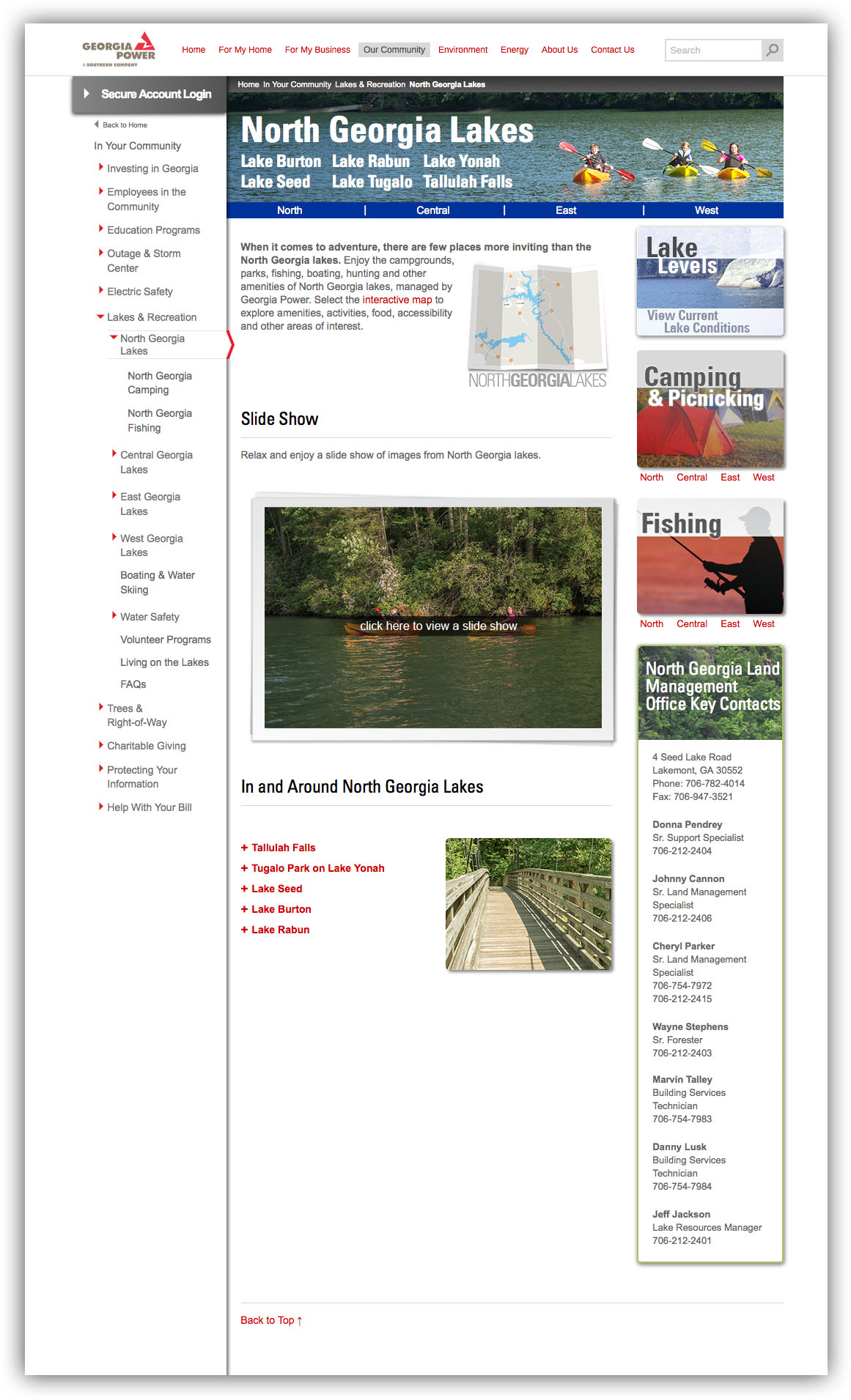
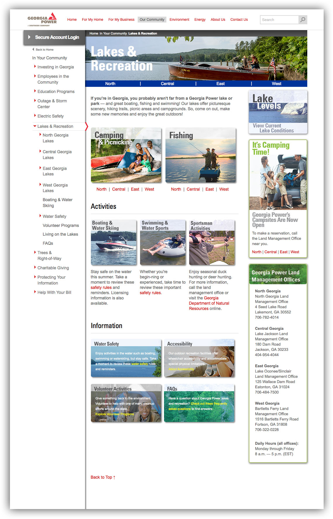
Georgia Power Lakes and Recreation's section on the Georgia Power website was old, outdated, and did communicate the full range of amenities and activities as the many lakes that Georgia Power managed.
The Lake and Recreation department wanted an update that clearly communicate the fun and activities residents could find at their lakes.
I started the design process almost ground up, discarding previous creative they didn't approve.
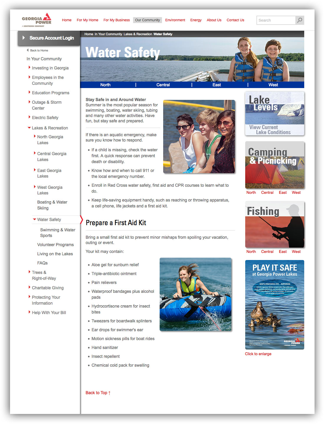
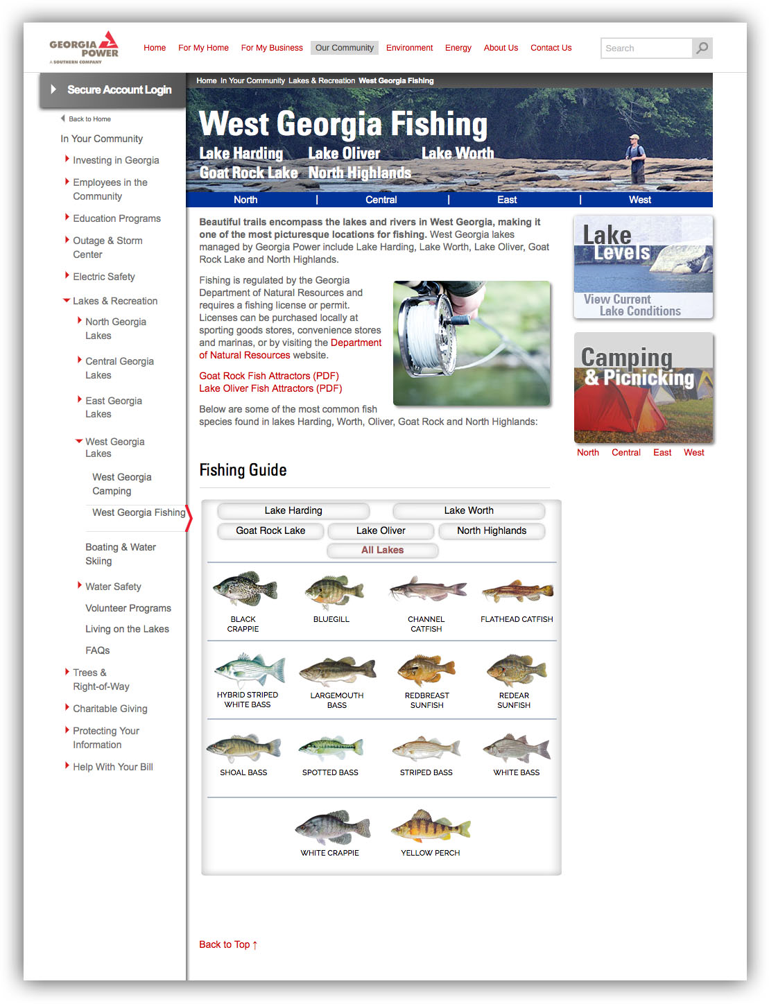
The Solution
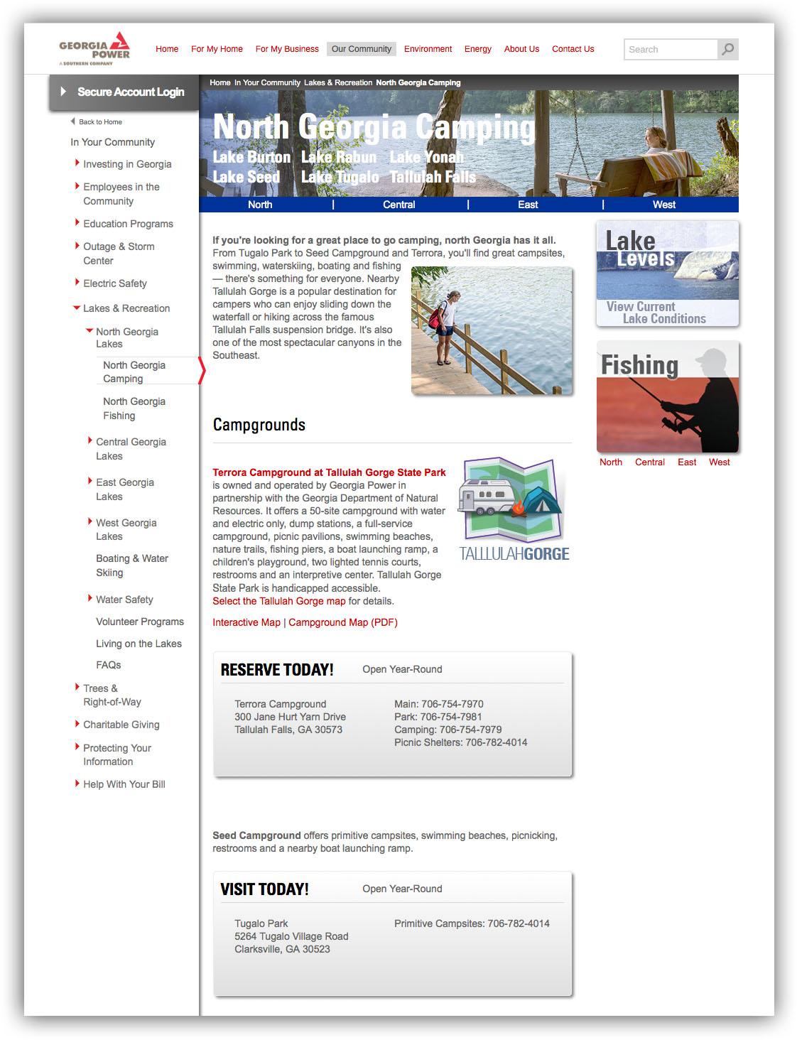
The content manager interviewed with park managers, getting a clear and specific list of amenities. Armed with an accurate list of content, we presented several design rounds to the executive team, finalizing a finished concept they were excited with.
I focused on making the navigation was easy to understand and browse. I also focused on adding appropriate images to give a visual of the activities at the lakes.
I created a sub-navigation system, different from main Georgia Power website, allowing users to browse within their area of interest. For example, those wanting to know more about fishing can navigate between different lakes( without needed to go back to the top level of navigation, as it was previously done)
For the visuals, a photographer and I went to each of the lakes, and i directed photoshoots. We used the photographs to clearly document the available amenities and beauty of each lake.

Do you know Jack About Branding?
Design + Presentation + Illustration
Do you know Jack About Branding?
Design + Presentation + Illustration
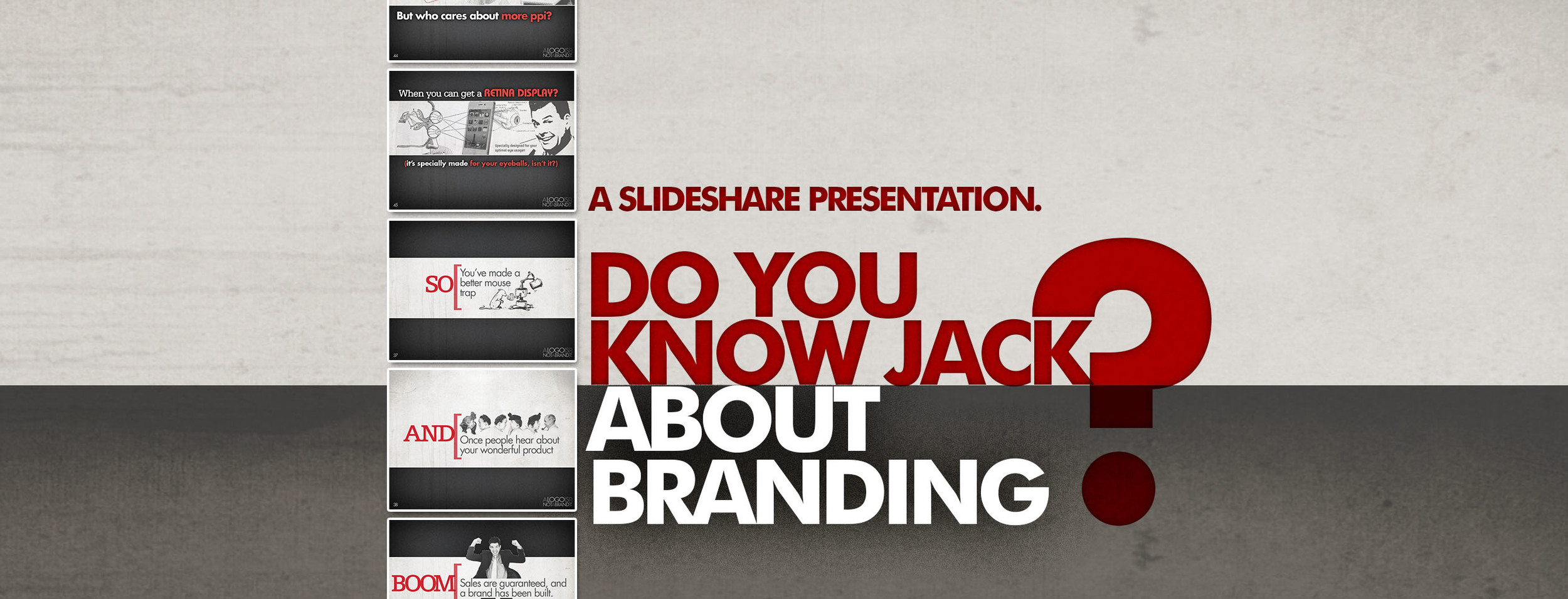
A Slideshare presentation
I created a presentation to share my view on branding, and often misdiagnosed and confusing design practice. i often share this with clients and colleagues to at the beginning of branding projects.
I made this into a Slideshare presentation and it's been viewed 700 times, downloaded 23 time, and favorited once( by Guiseppe).
I enjoy any opportunity to talk about desigg, and also I like the challenge of presenting difficult concpets, especially when I can use narration, images, and design to really help simplify or clarify difficult concepts.
If you have any issues viewing the embedded Slideshare presentation, please click here.
You can find more of my ideas on branding at my blog, A Logo is Not a Brand.


