
LLER Language Reader App
UI +UX + Product Design + Art Direction
LLER Language Reader App
UI +UX + Product Design + Art Direction
The concept
This small start-up has tackled the mission of bringing language learning, social collaboration and e-readers all together. Already having a website that helps language learners crowdsource their learning efforts, LLER( Language Learning E-Reader) was ready to create an app with these features.
USER STORIES AND PERSONAS
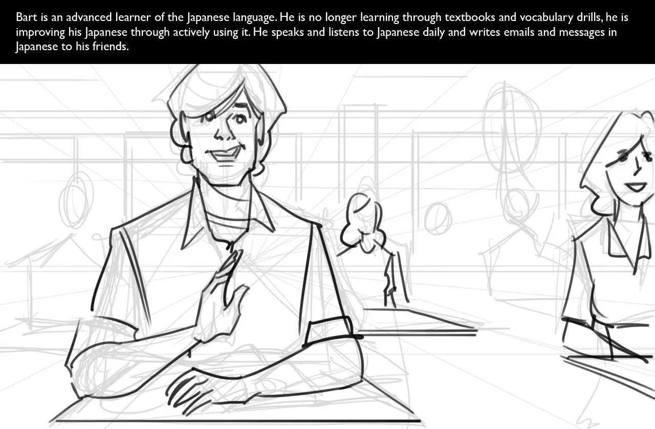
User stories were created to flesh out the UX. I created storyboards and wireframes to envision the user experience and functionality needed for the app.
To begin the project, I worked with the client to list the goals and functionalities needed. And to further support this, I led a session where we put together a narrative of how someone would use the app.
I translated the narrative into specific user stories, building the foundation and scope of the project:
- Read foreign language books
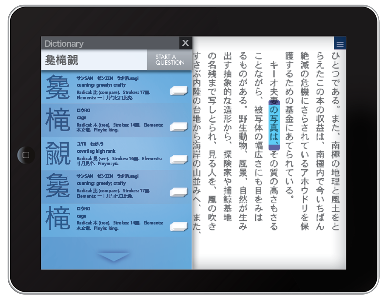
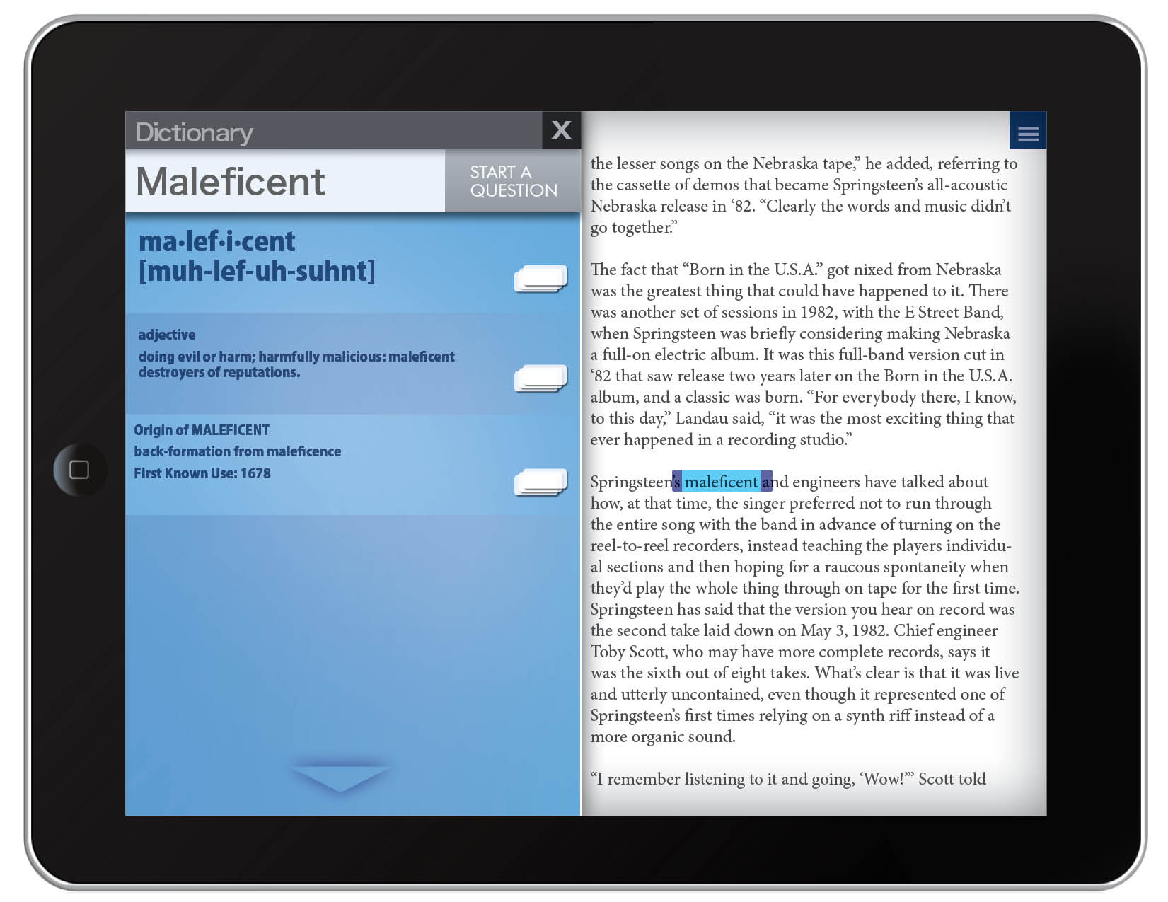
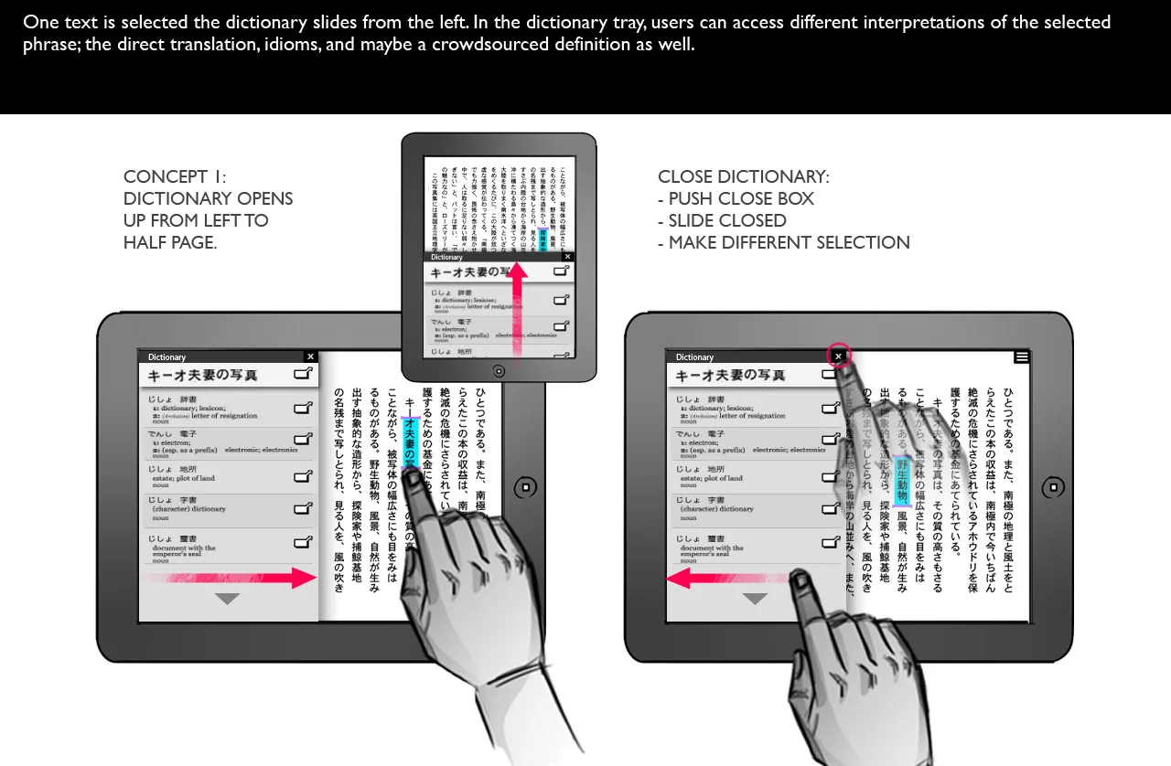
- Translate word and phrases
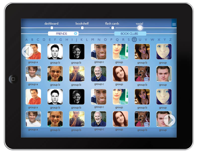
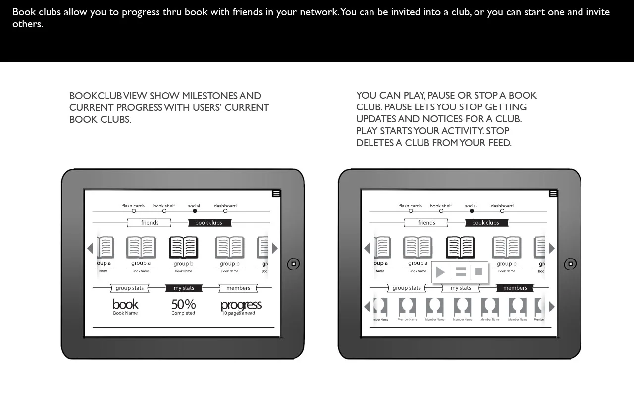
- Be social, and get encouragement from other users
- Save words and phrases to refer to later
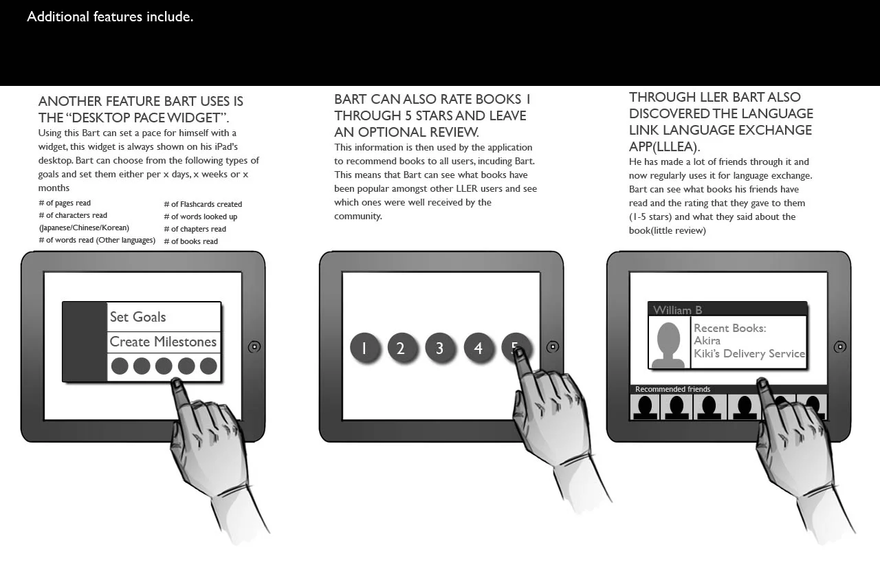
- Show relevant statistics about reading habits
- Show reading progress
- Make it interesting/fun
MICRO INTERACTIONS
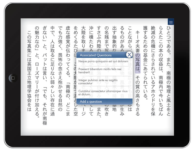
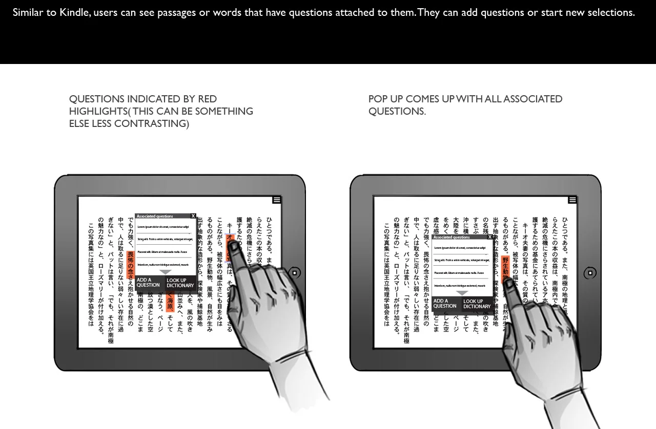
The main feature of the app would be selecting text to be translated, so I had to create clear way for users to highlight text. Along with that I established several other concepts for micro interactions that could be used within the app.
FLASH CARDS
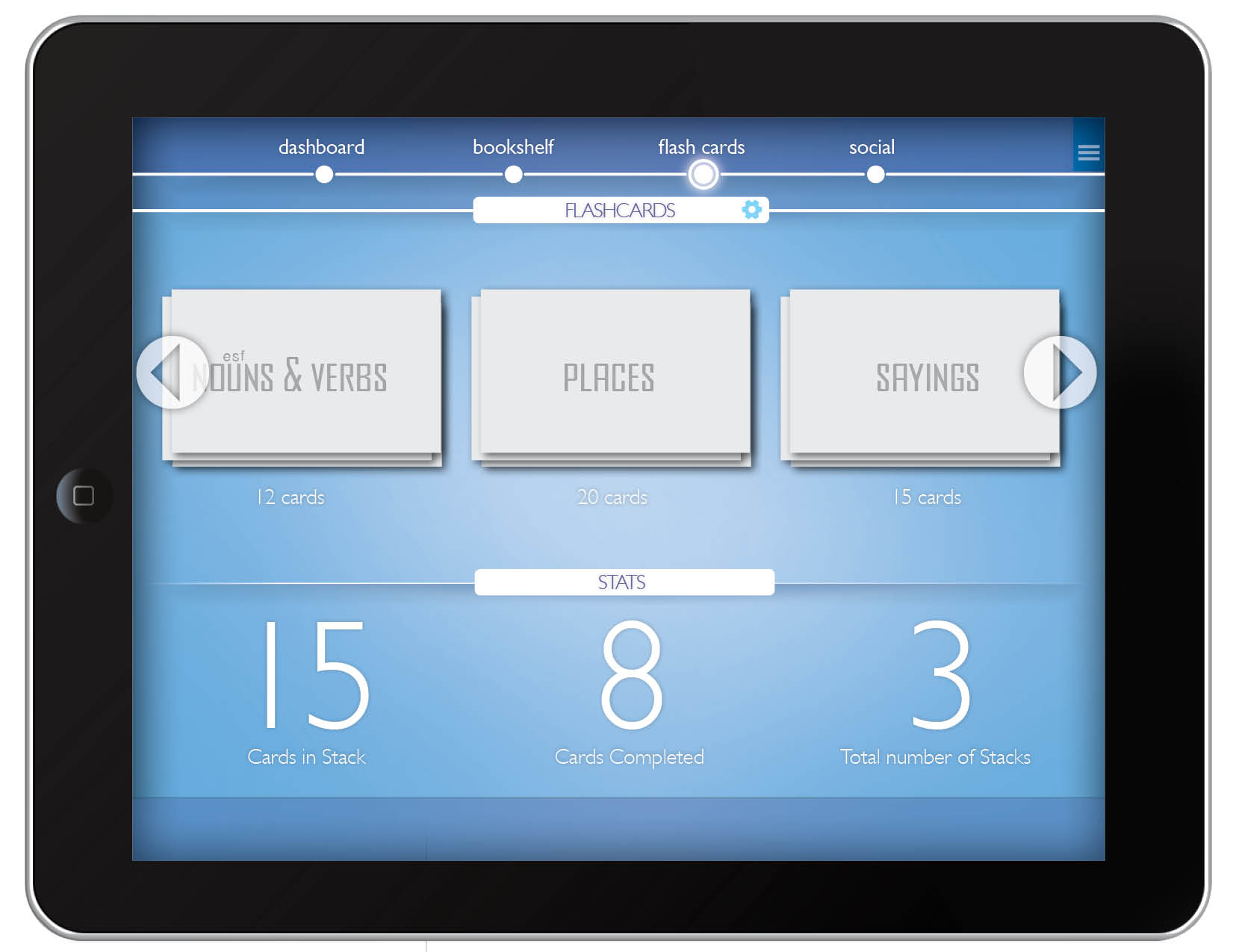
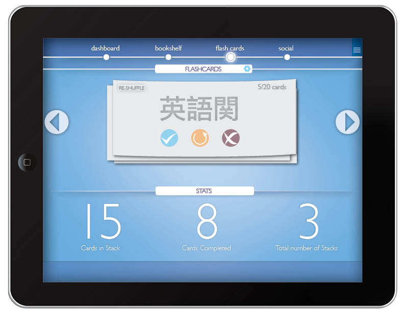
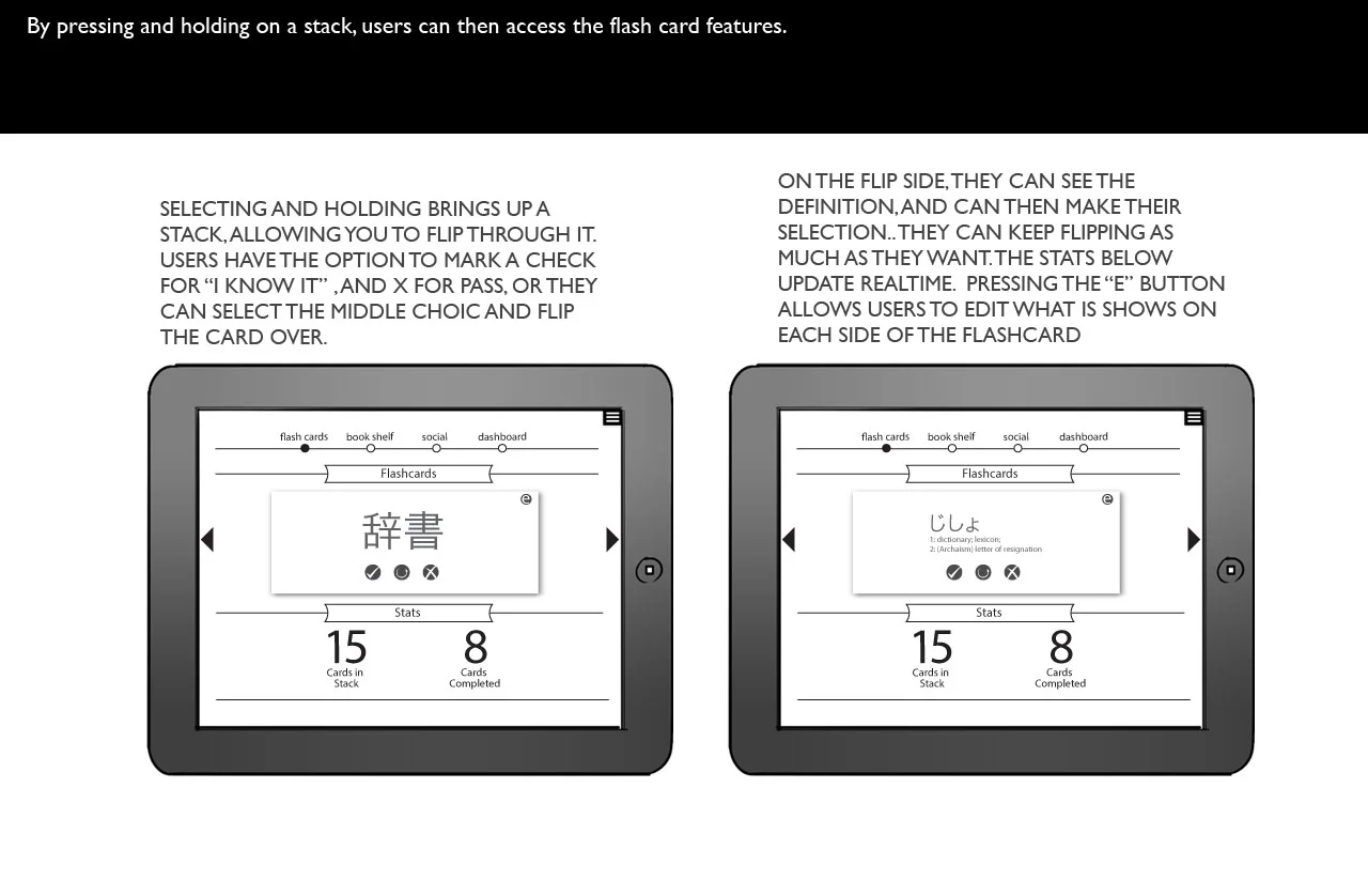
Roleplaying through the user stories, I realized the best way to save and recall phrases or words would be using the classic Flashcard paradigm. Flash cards are often used for memory and recall activities and make a great visual metaphor.
WIREFRAMING THE NAVIGATION AND INTERACTIONS
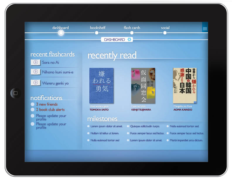
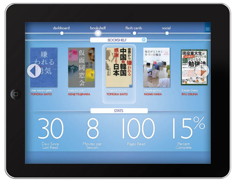
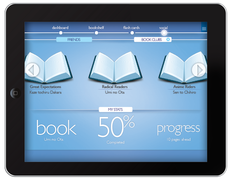
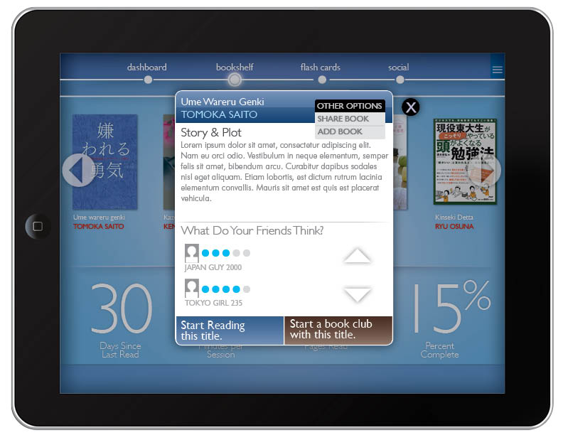
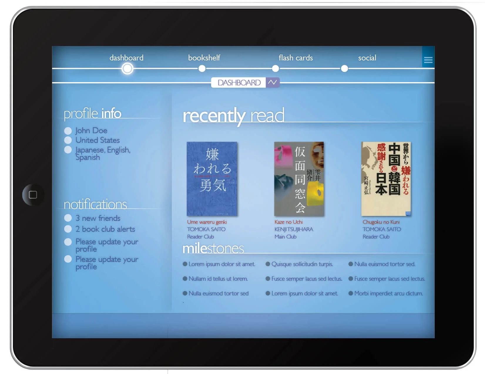
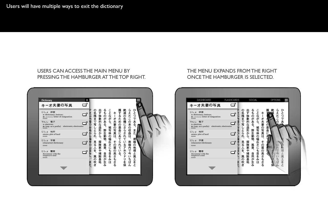
Following the user stories, and getting insights for the clients existing website, a similar collaborative learning site, I created a top level structure including a Dashboard, Bookshelf, Flashcards, and social.
The Dashboard is to place where social and statistical information is displayed to encourage and inform - the main goal of the app. Going to the bookshelf and Flashcards, I reserved the bottom half of the page to display contextual statistics and info, giving the user a consistent place to find deeper information about their current activities.
the final product
