
Compliance on Demand
UX + Testing + Interaction Design
Compliance on Demand
UX + Testing + Interaction Design
The Problem : OUTDATD CONFUSING COMPLIANCE PORTAL
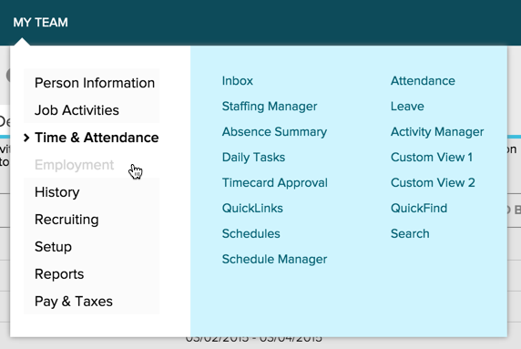
The ADP menu for clients requires clients to select an item for the main nav, and then access sub categories, each with bucket of links.
If a client knows the exact path to go, they can get to content easily, but if not, users user found it difficult to find content.
The subcategory buckets don’t map well to all client's mental architecture, forcing them to inefficiently search through the categories for page links.
solution : unbucket content and show everything at once
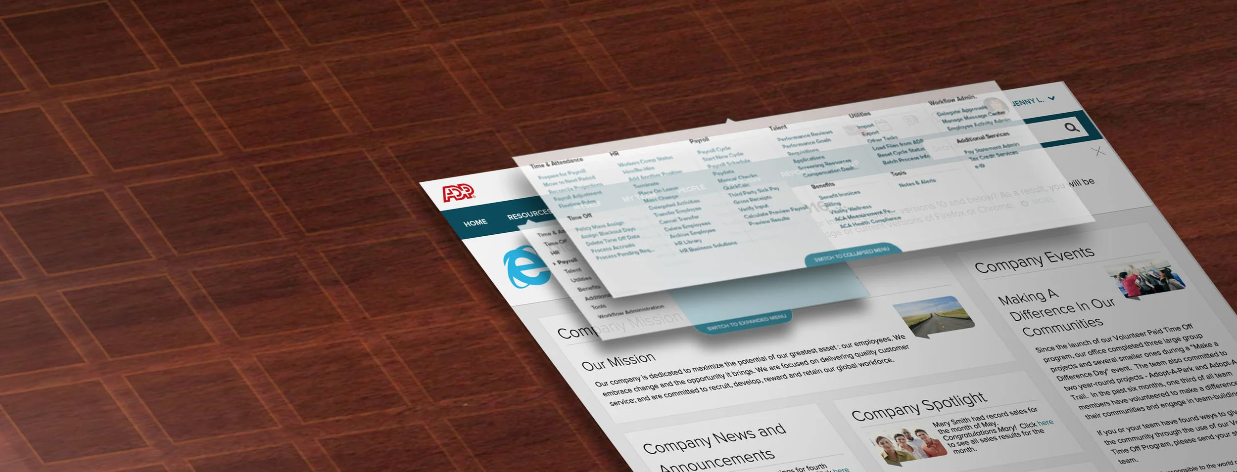
Via research, we found a better way to categorize content that matched the mental map of clients. In addition to this, we also tested an expanded view of the menu, showing all available content at once.
This expanded menu tested well - it "un-bucketed" the content making it easier to find and discover pages that were once nested within separate sections
Toggle Switch : Giving users a choice
We added a toggle that allowed users to “Opt In” for the expanded menu - some user knew the current architecture well, and found it more efficient.
Feedback from research found that the initial design for the toggle switch was very hard to find for users.
For a redesign, I chose a visual pattern that "broke" the rectangular silhouette of the menu dropdown.
With the new design, users were able to find the toggle, and switch between the expanded and collapsed versions with no problem.
Initial toggle pattern : Users found it difficult to notice during research
Redesigned Toggle pattern : Breaking the square shape helped user notice the new toggle design
DELIVERY : Final DESIGN and patent
This new Menu Design was released to clients and is being used at moderate rate. This usage rate makes sense, and maps closely to the amount of clients with usage problems in the legacy design.
Two Patents were filed against the Expanded Menu pattern.

